This chart explains it well
It shows the states that PAY the bills, (Blue) and the states that get the welfare (Red). Nothing new here, but is good to see it in an actual chart, that shows the 'givers', vs 'takers', in the TAX world and the split between Dem and Repub states, where education makes a HUGE difference in income. Totally different from what the sheep are led to believe. Click on to enlarge.
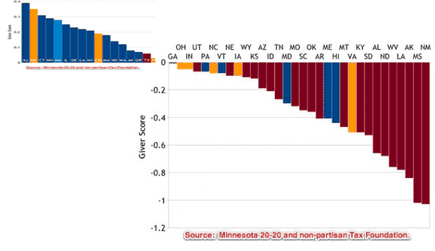
Homework assignment. Check out the states with the highest % of Repubs. Then check out lowest educ/income. There is over a 90% correlation, Dem/Pub, all the way through the chart. Coincidence? I don't think so. Just cuz Pubs don't like to admit it, doesn't mean it's not true. I bring this up only to rebuke the ignorant Pub rants with which I am constantly bombarded. There's a reason Pubs are anti science and education, cuz education creates Dems. Not always, obviously, but significantly. Nothing new here, but you wonder why it scares me that the Pubs are taking over the country, again, with the help of FOXLies? Nothing good ever happens...


Comments